
Image from IMDB
Like a good soundtrack, color can fill a scene with emotion and tension, signify changes in characters and themes, and create a compelling atmosphere. Color has a deep psychological impact on the way we watch and interpret images.
A good cinematographer knows that color tells its own story and should be treated with as much weight as the script. Certain color combinations help images pop and draw attention to details. In the case of branded content, the right color palette differentiates products and gives images an extra layer of visual branding.
So, how do you go about choosing the right color palette for your project? Well, it all starts with the color wheel and how colors relate to each other on this imaginary apparatus.
Color theory provides practical guidance for using certain color combinations, or “schemes,” based on their relationships on the wheel. There are two kinds of color schemes: balanced color schemes (also known as “color harmonies” or “color chords”), and discordant schemes.
Balanced color palettes are used more frequently in film and are illustrated in the chart below. Keep in mind, every color has both positive and negative connotations; how the color is interpreted depends on the context of the story.

Image from Studio Binder
Let’s give the color wheel a spin and take a look at how filmmakers are using color theory in their own films to add meaning and character to their storytelling.
Wes Anderson is well-known for his unconventional use of color, most notably for his use of monochromatic color schemes. These schemes, based on a single color hue, underscore his quirky sense of humor, style, and characters’ eccentricities. These colors are an essential part of the well-established Wes Anderson aesthetic.
In Moonrise Kingdom, Anderson deftly uses shades of yellows to accentuate feelings of innocence, youthfulness and nostalgia. Through careful production design and some light color grading, this extreme color harmony creates a heightened sense of reality that perfectly accents this charming runaway couple’s story.

Image from IMDB
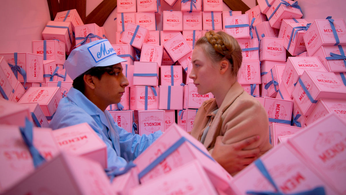
In Grand Budapest Hotel, Anderson uses a variety of monochromatic schemes to offset the most dramatic moments with comedic undertones.
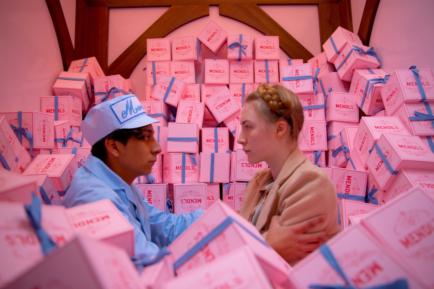
Image from IMDB
Monochromatic color schemes have a dark side, too. In The Matrix, each scene is overlaid with a greenish tint, enhancing the movie’s dream-like dystopia.
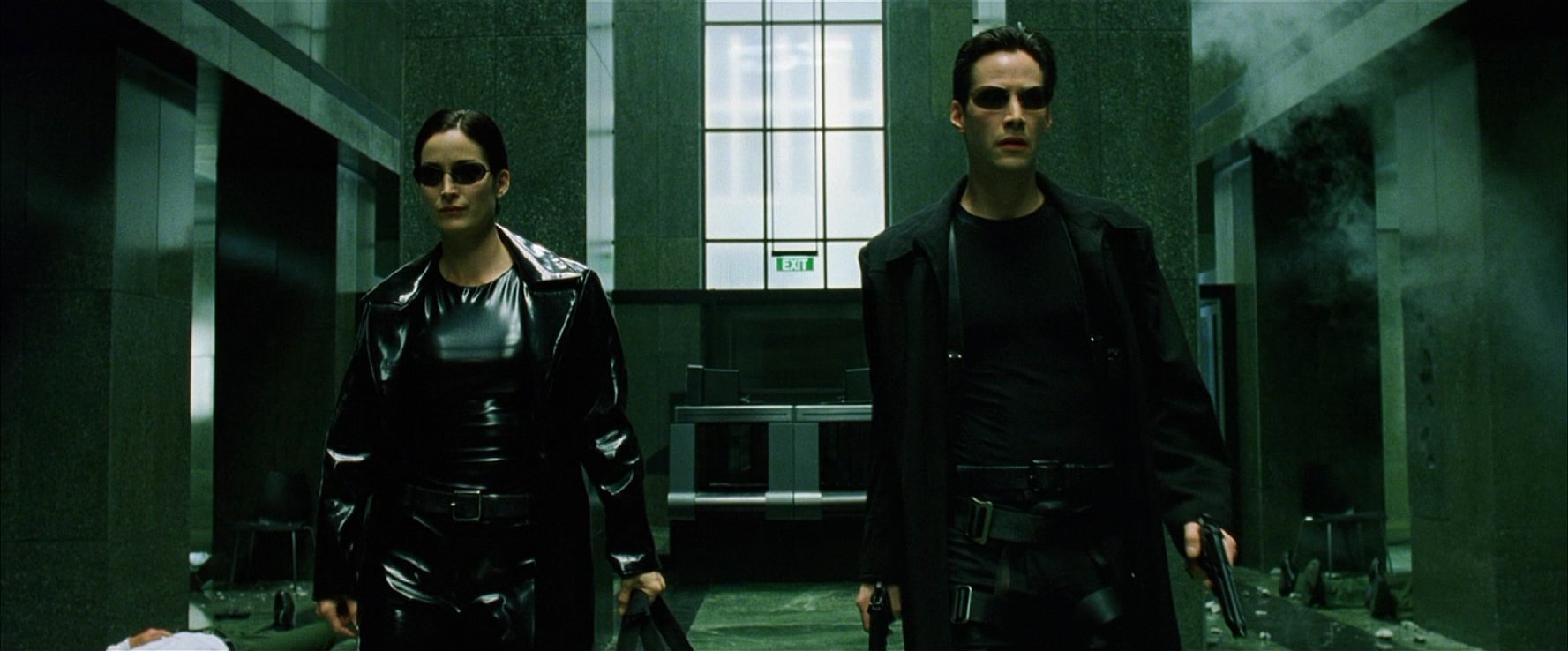
Image from IMDB
Green appears in almost every scene, right down to The Oracle’s kitchen counters.

Image from Fandom
Another great example of a monochromatic color scheme can be found in “The Mary Alice Brandon File.” This short film was created by The Spear Sisters for Lionsgate and Volvo’s “The Storytellers: New Voices of the Twilight Saga” contest on Tongal. The Spear Sisters use grays to convey the depressed and hopeless state of mind that the main character is experiencing.
When filmmakers are looking for an intense color contrast, they look no further than complementary colors. Complementary colors are located on opposite sides of the color wheel and always combine one warm and one cool color to produce a vibrant, high-contrast effect. They can be used to spotlight a certain character or element on screen. Damien Chazelle uses these types of colors in La La Land. For instance, in the scene below Mia’s dress deeply contrasts against the purple sky, surrounding her in an electric energy.
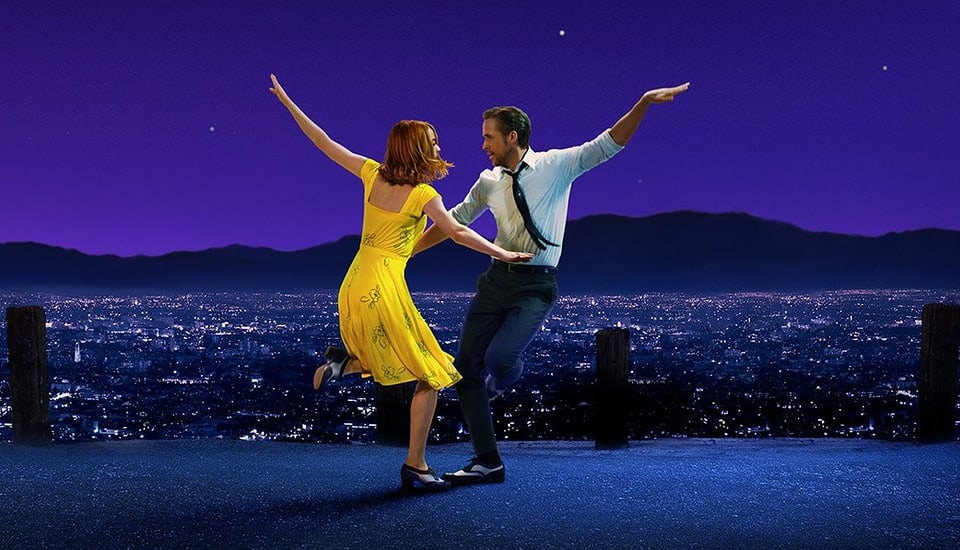
Image from The Telegraph
Another great use of complementary colors can be found in “Maryellen & The Brightest Star,” a short film by Maya Rudolph, created on Tongal for American Girl. In the scene at 10:40, you can see that while the predominant color scheme is muted earth tones, Maryellen stands out from all the other characters and the environment in her all red astronaut costume.
Teal and orange is the most commonly used complementary color scheme in Hollywood blockbusters, so much so that people across the internet have lamented its obsessive overuse. These dueling tones are often associated with conflict and heavy action scenes because the blue and orange tones can be easily applied across multiple locations, and the warmer skin tones make actors pop against the backdrop.
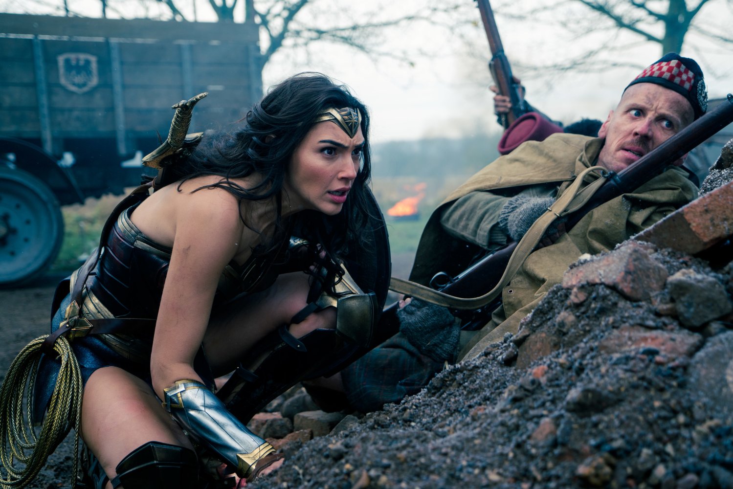
Image from IMDB

Image from IMDB
In branded content, the intense contrast that complementary colors bring to the screen can be used to draw attention to on-screen products. As a general rule, warm and bright colors visually enlarge objects and make them seem closer.
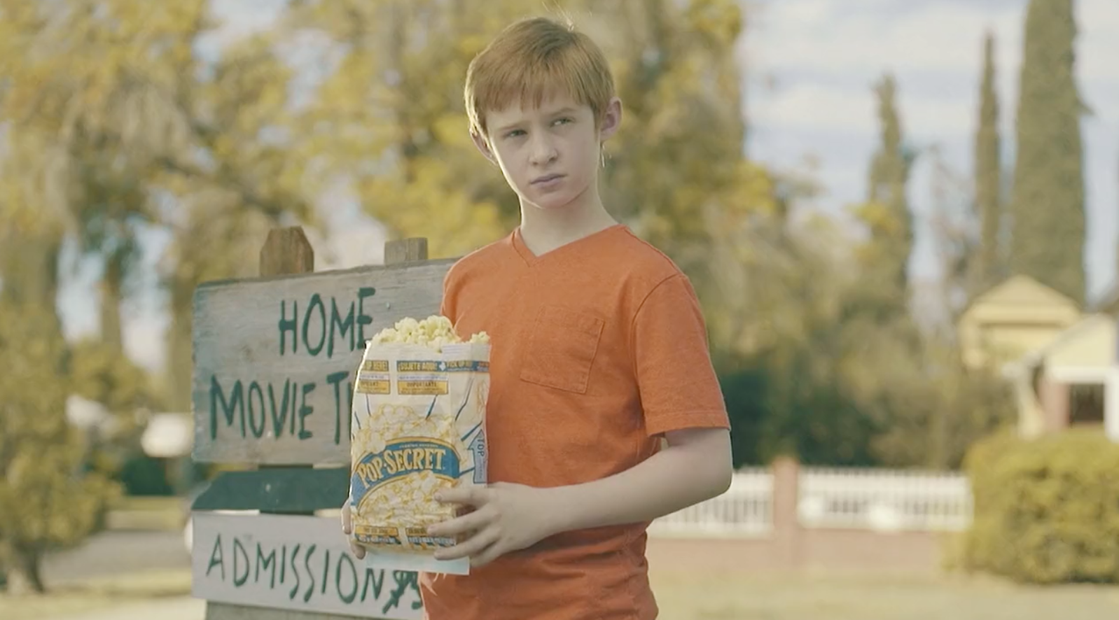
Often found in nature, analogous colors neighbor each other on the color wheel. Filmmakers often choose from either warm or cool colors for their analogous schemes. Because of this, there tends to be less contrast than with complementary colors, creating an overall balance and harmony. This Pop Secret spot, made on Tongal by Side of Fries, uses an analogous color scheme of yellow and orange, but includes some slight complementary contrast between the blue on the bag of popcorn and the boy’s shirt.
Here’s a good example of analogous colors from the movie Moonlight using the cooler parts of the color spectrum. It comprises a vibrant array of blues, purples and greens. Analogous cool colors have a slightly more jarring effect. Moonlight is a movie all filmmakers should watch if they want to learn just how to use color schemes to represent a character’s journey.

Image from The New York Times
A triadic color scheme uses colors that are evenly spaced across the color wheel (i.e. red, blue and yellow). It’s the least commonly used color scheme around and is often used for 1970s period pieces. This recent commercial by GE called "Meet Molly, The Girl Who Never Stops Inventing" is a perfect example of how to apply the triadic scheme.
The triadic scheme is sprinkled throughout, from her red raincoat with yellow stripes, to the red lawnmower with yellow flags. This commercial deserves a round of applause for its cinematic use of color scheme. At the end of the commercial, Molly is working as an engineer for GE and the color scheme changes to a more subdued blue, showing both a passage of time and development of character.
In The 6th Sense, red is used to signify danger and to say, "Something scary is about to happen!"
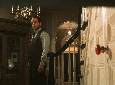
Image from IMDB
When a color becomes associated with a character and then suddenly changes, the filmmaker is trying to tell us something about that character. Discordant color schemes can also symbolize madness and instability. Here’s the exact same setup from Moonlight, except this time a discordant color scheme is used to magnify the mom’s manic behavior.

Image from IMDB
Two to three key colors will help you sustain your message in the audience’s mind. More than that, and the visual can become chaotic (which could be your intention). Make sure your conversations about color start early in pre-production. Moodboards and concept art are great tools for communicating your film's color palette.
And keep in mind, there are no ideal sets of colors. Many successful projects have broken the rules. Color theory norms should be understood by filmmakers, but never seen as limitations.
In the comments section below, tell us how you’ve creatively used color in your films and branded content to convey mood and theme.
Want to create a color palette that will make your brand's content pop? Tongal is here to help!

Loved reading this, so interesting!

This is so interesting, Maddie! It's amazing to see what a difference color palettes can make in the tone or mood of films (and commercials!).